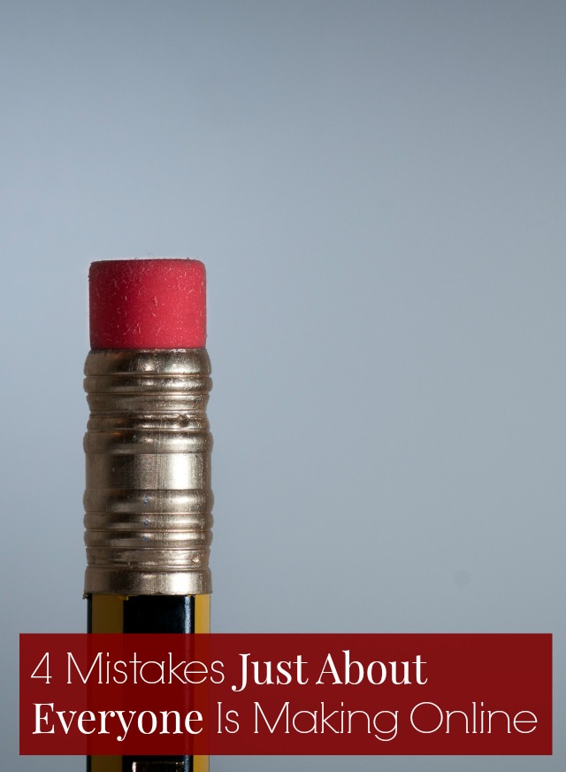
Doesn’t that title seem alarmist?
Here is the giant asterisk that should accompany it:
* And I was totally making these mistakes for years and only figured them out through working with hundreds of clients and I’d be remiss if I didn’t tell you about this so you can be smarter than me and not screw this up for years, too.
But that’s a pretty big asterisk, right?
If I’ve given your site a free once-over and sent you three suggestions (available to anyone on my list) or if you’ve purchased a Secret Weapon, there’s a good chance I’ve made these suggestions to you - because they’re super common! Thankfully, they only take a few minutes to fix. If you’re feeling ambitious, you can set aside a few minutes every day to work through your archives and tweak old posts or you can just do this for all your future posts!
1. No call-to-action on the About page
Call-to-action is copywriter speak for telling your readers what to do next. Your About page is your most visited page - the page people read before they hire you, buy your products, or sign up for your newsletter list. So shouldn’t we be telling them (politely) where they can buy our stuff, how they can work with us, how to sign up for our newsletter, and where they can find us on social media?
Here’s how I do it on my Yes & Yes About page:
Are you a yeasayer, a world-traveler or someone who needs helps making their online space amazing?
If you want, you can…
* Be friends on Facebook or Twitter (I promise to share photos of my cat in costume)
* Sign up for my non-annoying newsletters (Yes and Yes newsletter // Small Business newsletter)
* Buy a travel ebook to make your next trip waaaay more awesome (Adventures In Lady Travel // The Wanderlust Workbook)
* Book a Secret Weapon with me to shape up your online life
* Buy these jeans, this lipstick, these ballet flats, these packing cubes and thank me later
2. Not using images in tweets
Did you know that image-based tweets are 94% (!!!) more likely to get retweeted? Crazy, right? I can certainly see this with my own tweets. (If you want to see how your tweets are performing, go to ads.twitter.com and click on ‘tweet activity.’) Images should be 440×220 and you can even pre-schedule them with Tweetdeck!
Is it a hassle to create images specific to Twitter? Yes. Is it worth it? Toooootally. It’s particularly worth it for pretty, design-y posts like this or posts with titles too long for 140 characters.
3. Not making posts Pinterest-friendly
I only realized I needed to do this when Meg wrote this guest post for me! For a long time I ignored Pinterest because I couldn’t figure out how to “leverage it for my brand” (puke) but that’s sort of not the point. Even if you don’t use Pinterest, your readers probably do and they’ll be more likely to pin your posts if you’re using tall, long photos with appropriate title text. This is particularly important if you blog about food, fashion, DIYs, or design.
4. Not linking to older posts (or services or offerings) within blog posts
So many of us tuck a ‘hire me’ or ‘services’ tab into our menu bar and call it a day or we’ve got one of those archive widgets in the sidebar. But it’s a lot more engaging and clickable when we link to related posts within the text of a new post or write posts that relate to our newsletter opt-ins.
If you’re not sure how to work older posts into new posts in a natural-sounding, organic way just use ye olde P.S. trick. It’s an established (and crazy effective) copywriting trick to drive people towards your archives and it works a lot better than that those ‘related post’ plugins. You can see how I use it the P.S. trick here and the write-for-the-opt-in trick here.
What are some of the mistakes you made when you first started blogging? And if you’ve got a suggestions for how I could improve my site or blogging I’d love to hear it!
P.S. 6 more oddly obvious mistakes you might be making
photo by Daniel Novta // cc


